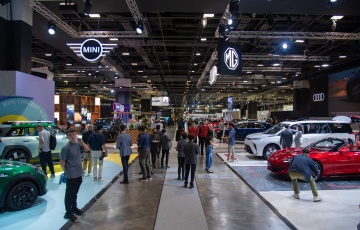
Here’s how in-car screens have grown through history
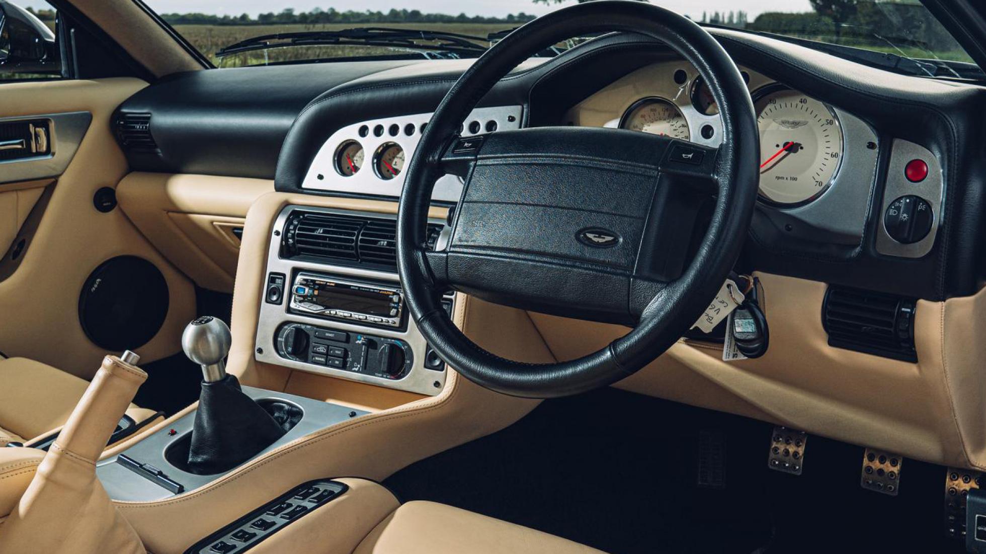
Ahh, the ol' DIN headunits
For a rosy few decades through most of the 1980s, 1990s and into the 2000s, most cars could only boast a screen about as impressive as the one on your Casio wristwatch.
The classic DIN radio would inform you what frequency you were tuned into, via the same sort of seven-segment display you’d find on a microwave. Maybe if you were really flash, you’d have a posh unit with dancing light segments that flashed in time with the bass.
And that, for a long time, was as exciting as in-car screens got. Happily, this was also a time when traction control was a bit slow on the uptake, so your car’s handling usually kept you occupied instead.

Buick Riviera: the touchscreen grandaddy
Here’s your Top Gear Top Fact Of Today: the first production car to have a touchscreen was… American. But not a Tesla, internet babies will be staggered to learn. In fact, Buick got there first by slotting this 9-inch ‘Graphic Control Center’ into the Rivieria way back in 1986.
Commercials – which are Ameri-speak for ‘adverts’ – proclaimed the green’n’black cathode-ray tube ‘GCC’ took care of a massive 91 functions which would otherwise have required buttons, switches and knobs on the dashboard.
However, there were flaws. For one thing, the system emitted a screeching ‘BEEP’ every time it was touched. Secondly – get this – drivers complained they found taking their eyes off the road to scan through their fuel economy (not much) and what was on the radio (country) rather distracting. Imagine that.
So, Buick sensibly dropped the GCC from order books, and touchscreens went back to the drawing board before invading our cars again two decades later…

youHate iDrive
In the meantime, it was BMW who next went ultra-ambitious with an attempt to (re)invent infotainment. iDrive arrived on the 2002-model year 7 Series, which was clever of BMW. It gave BMW traditionalists something else to get frothed-up over besides the angry-ogre styling.
The 8.8-inch screen replaced all of BMW’s usual entertainment switchgear with one single operator-controlled knob. There wasn’t even a Menu shortcut or Back key for two years, until BMW knelt to the backlash and un-minimalised the controls.
Ironically, iDrive has matured through several generations into among the finest in-car systems in the world today, with rapid processors, clear menus, and a best-of-both-worlds mixture of touchscreen operation and the classic clickwheel living on, even into the techy new electric iX. Move over Darwin, we’ve got a new theory of evolution.
Tesla's first ludicrous screen
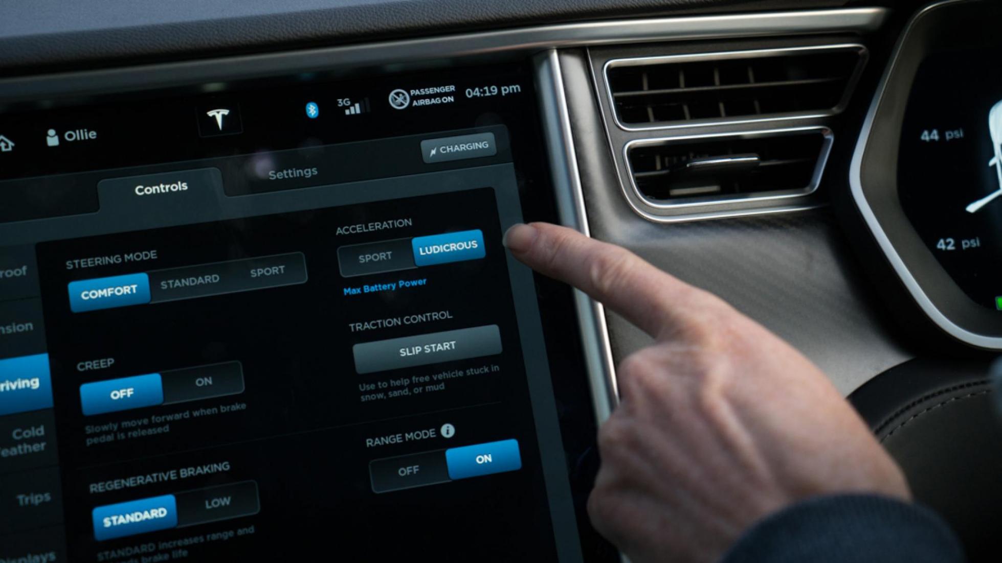
It seemed clickwheels and modest screens would win the war right up until 2012, when Tesla detonated a nuke in the calm waters of Infotainmentville, with this humdinger. The centrepiece of its electric four-door sedan's interior is a whopping 17-inch portrait display that controls… everything.
Well, except steering, stopping and going. But the settings for how the car does those things live in the screen.
So do the menus for the climate control, the navigation, the media, the safety systems and the charging set-up. Tesla took an almighty gamble entrusting all of the Model S’s functions into one megascreen… but it worked.
The interface was intuitive and the processor could keep up with your fingertip. And while we have our reservations about losing all of our precious buttons, there’s no doubt this display made the entire car industry’s efforts look lazy and backward.
Tesla does it again for the Model 3
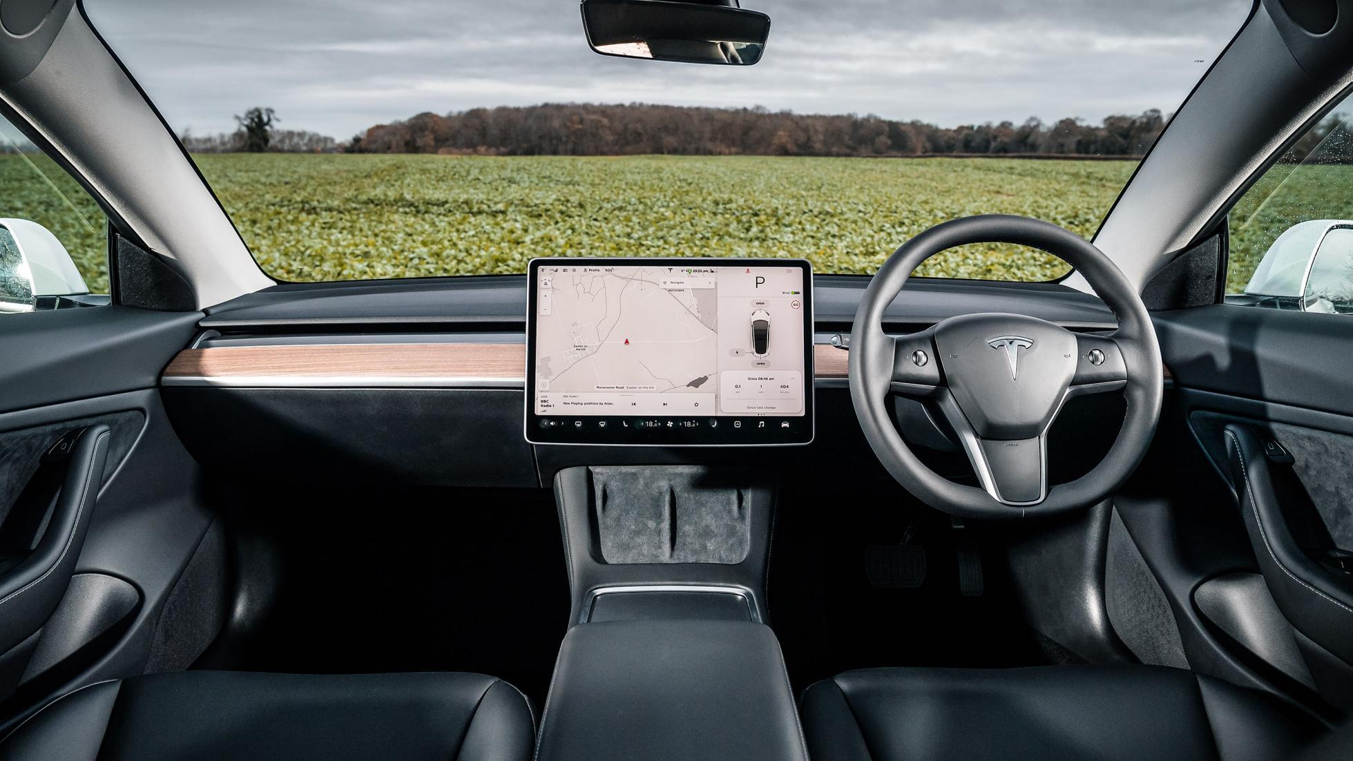
So obviously, Tesla had to out-do itself. For the more affordable Model 3, the screen shrunk a tad to just 15.4 inches and rotated through 90 degrees. But it was more powerful than the early Model S-kind, and even took care of displaying your current speed. The driver’s instrument screen was gone.
We’re still not fans of that decision if we’re honest, but most people seem to have been too charmed by the built-in karaoke, arcade games and Easter eggs to care. Even four years on the from the Model 3’s debut, this remains the most impressive touchscreen interface in any car we’ve driven. Who can top it?
Porsche picks some pixels
You can plot The Tesla Effect on the rest of the car industry by looking at how the old guard’s designs changed course overnight after Tesla landed.
Take Porsche as a prime example. For fifty years Porsche did grey interiors with sensible buttons. If you threw them a few Marks they might upholster it in 1970s bathroom-suite green, or second hand placenta red. But all the sensible buttons were still there.
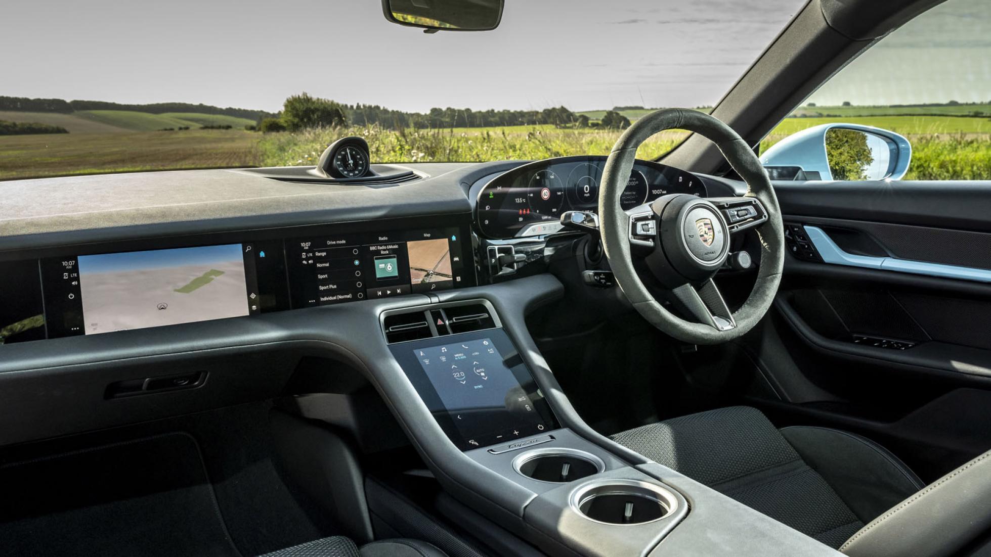
Post-Tesla, we got the Taycan, and a whole new style of Porsche interior. Yes, Stuttgart has been dabbling with touchscreens in 911s and Caymans already and gone a bit pixel-crazy in the 918 Spyder, but all of a sudden, buttons were verboten. Alongside a main touchscreen front and centre, you can option in a second monitor for the passenger.
The climate control switches are gone, replaced by you-guessed-it. Even the classic five-wide Porsche dial cluster is completely digital and framed by touch-sensitive buttons to stiffen up the suspension and turn on the lights. Brave new world, huh?
In short, Porsche loves a screen, but it’s resisting merging them into one giant interface… so far.
Ford's Mustang Mach-E joins in
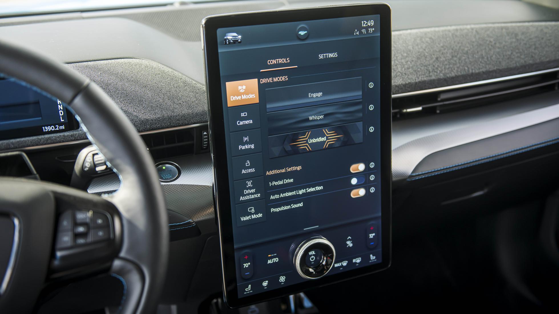
Obviously Ford’s Tesla-rival wasn’t going to show up to the party without an XXXXL screen. The Mustang Mach-E’s main event stretches for 15.5 inches through the electric crossover’s interior, like a lost airport departures monitor that’s decided to live in a car.
However, Ford decided not to go quite as minimalist as the Muskmobiles. For one thing, there’s a built-in volume knob. And ahead of the driver, Ford fitted a small but useful instrument display to put the car’s speed in your eyeline.
Enter Hyperscreen: the Mercedes EQS
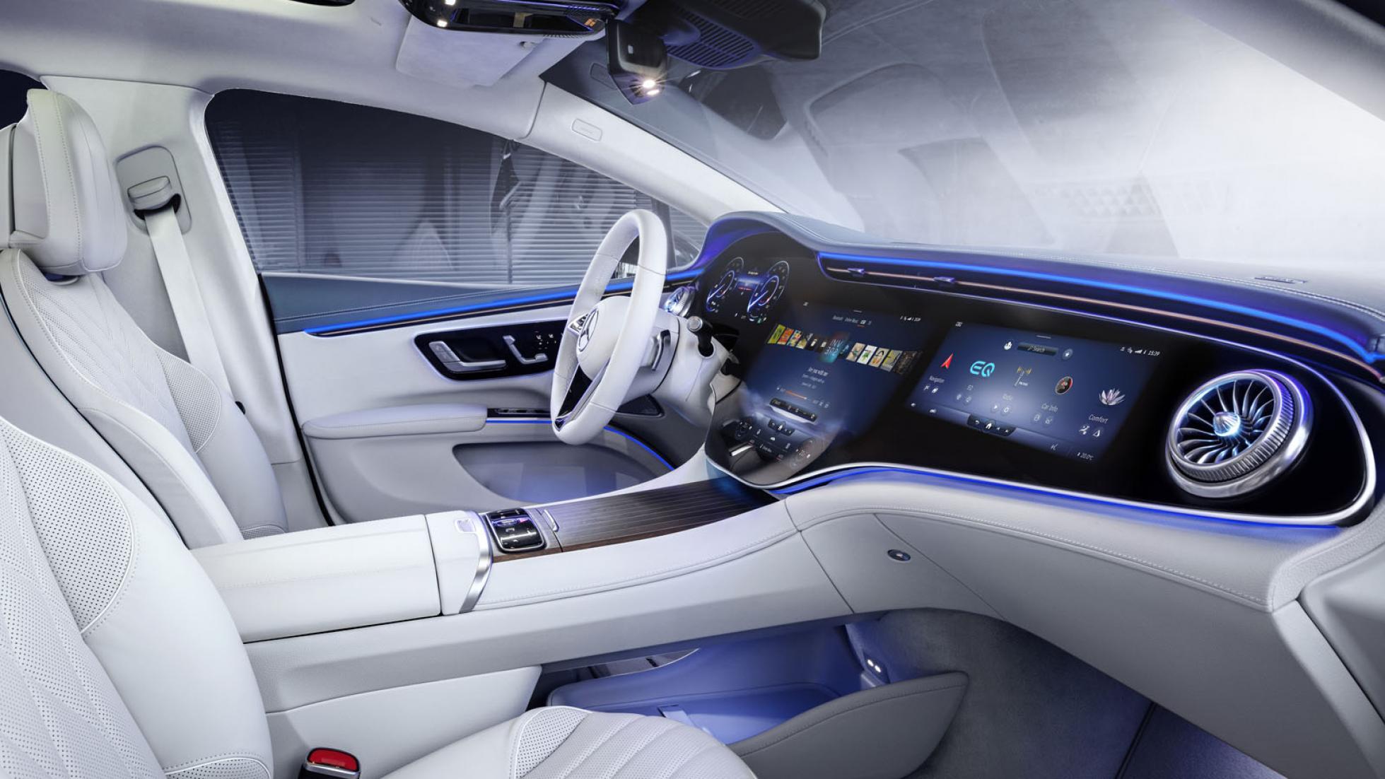
And so we arrive at today’s emperor of screen real estate: the Mercedes-Benz EQS with optional Hyperscreen. Strictly this is actually three separate screens (two 12.3-inchers, and one 17.7-incher), but they all live under the same 56-inch swathe of gorilla glass.
Not only does this thing have more computing power than the NASA computers that guided Apollo 11 to the surface of the moon, this cabin looks like the capsule that might carry humans to base camp on Mars.
The question is: where does the In-Car-Screen-Size Battle go from here?
Byton off more than they can chew?
Well, if Chinese EV start-up Byton is to be believed, the answer, friends, is MOAR SCREENS.
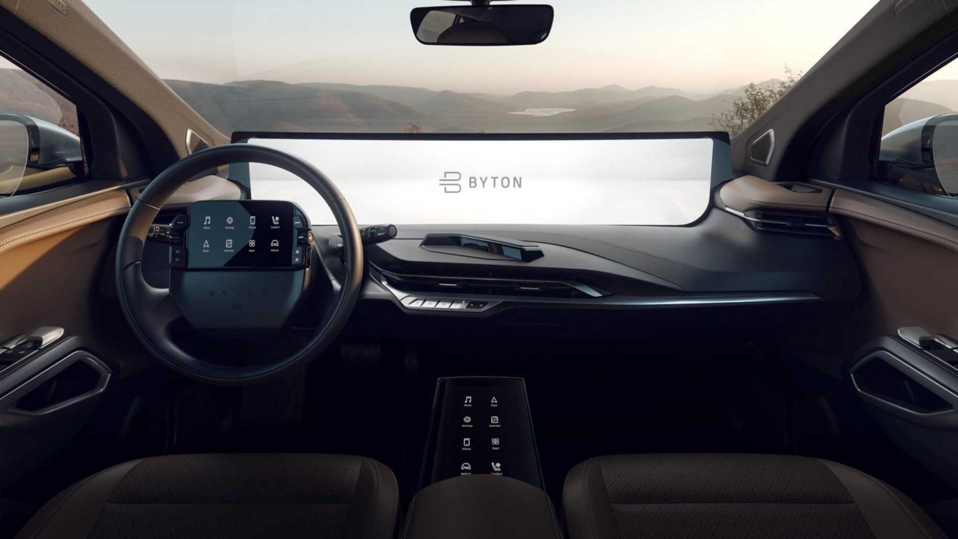
Welcome into the cockpit of the Byton M-Byte. On the outside, you might not have given it a second glance. It’s just a posh-looking family SUV. Seems to be a cross between a Volkswagen ID4 and a Range Rover Velar. Pop-out door handles hardly scream ‘Future’ any more. It’s been done.
Then we climb inside and find a 48-inch full-width dashboard screen. And a centre-console screen. And then, just for good measure, what looks like an iPad Mini strapped to the damn steering wheel. We’re shocked to learn the M-Byte doesn’t have cameras for door mirrors, just so it had an excuse to cover the A-pillars in screens too.
Apparently over 50,000 M-Bytes have been reserved in China, where the car is due to be launched this year. Don’t sit too close to the wheel, your eyes will go square. Didn’t your mum ever tell you that?
Is this the future, or have we already overshot the screen sweet spot?
STORY Ollie Kew
